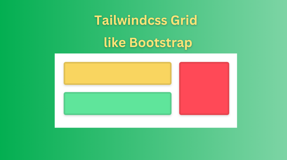
This time I just returned to code some frontend projects and Tailwindcss was chosen to develop the UI instead of Boostrap, but I have to read the docs several times to design the column flexbox.
What is Tailwindcss
Tailwind is a utility-first CSS framework. It provides so many classes that help us create UI with ease. At the writing time, the Tailwind repo has starred 61k times. Honestly, Tailwind’s UI-looking is better than Bootstrap.
Build a grid and column with Tailwindcss
Grid system
Bootstrap grid is powered by flexbox, it has a twelve-column system, five default responsive tiers, and a mobile-first system.
Tailwind CSS grids are powered by CSS Grids, which technically can have however many columns, five responsive tiers, lots of gutter gap utilities and are easily customizable.
Let’s take the following bootstrap grid:
<div class="container">
  <div class="row">
    <div class="col-sm">One of three columns</div>
    <div class="col-sm">One of three columns</div>
    <div class="col-sm">One of three columns</div>
  </div>
</div>
This will get us three columns like this:

With Tailwindcss, we can create a grid view with grid class like this:
div class="grid grid-cols-3">
  <div>One of three columns</div>
  <div>One of three columns</div>
  <div>One of three columns</div>
</div>
As you see, in Tailwind the columns are not fixed at 12, we can configure it by adding grid-cols-{x}
We can add some spacing between the columns by adding the gap property:
<div class="grid grid-cols-3 gap-8">
  <div>One of three columns</div>
  <div>One of three columns</div>
  <div>One of three columns</div>
</div>
Result:

Combine grid utilities with responsive
Sometimes, you want to make the content responsive. For example, on the mobile screen, there is only one column, but on the larger screen, we expect 3.
Implement like that:
<div class="grid grid-cols-1 md:grid-cols-3 gap-8">
  <div>One of three columns</div>
  <div>One of three columns</div>
  <div>One of three columns</div>
</div>
You can see here we use prefix md:, yeah Tailwind has some prefixes for responsive like md, lg, xl… You can check it here.
Tailwind conclusion
Tailwindcss has great responsive design, hope you can apply it into your code.
Happy coding!